-
-
- Scones
- Bread
- Cake & Pie
- Cookies
- Doughnuts
- Muffins & Quick Bread
- Pancakes
- Frostings & Fillings
- Gluten-Free
- Keto
- Soups
- Specialty
- Seasonal Mixes & Sets
- Seasonal
- Mix & Pan Sets
-
- Scone & Popover
- Doughnut & Muffin
- Cake & Pie
- Bundt & Specialty
- Bread
- Cookie & Sheet Pans
- Featured Brands
- Emile Henry
- Nordic Ware
- King Arthur
- Seasonal Pans & Sets
- Mix & Pan Sets
-
-
-
-
Classes by Location
- Class Calendar
- Contact Us
- Visit Us
- Baker's Rewards


September 3, 2020 at 12:27pm
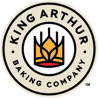
A logo must be different, eye catching, dynamic. I am hard pressed to see "wheat" in your new logo and it is more than uninteresting, it is, sorry, drab. I could always spot "King Arthur!"
Your own words in the newsletter say it: commitment to be the best," seeking deep fulfillment, community of bakers, core commitments to education, quality and integrity. These are the very tenements of King Arthur himself.
You have always been bakers; it is what flour means.
You have had it right for 290 years and it will be right for the next 230 years! Continue the original logo!