
-
-
- Scones
- Bread
- Cake & Pie
- Cookies
- Doughnuts
- Muffins & Quick Bread
- Pancakes
- Frostings & Fillings
- Gluten-Free
- Keto
- Soups
- Specialty
- Seasonal Mixes & Sets
- Seasonal
- Mix & Pan Sets
-
- Scone & Popover
- Doughnut & Muffin
- Cake & Pie
- Bundt & Specialty
- Bread
- Cookie & Sheet Pans
- Featured Brands
- Emile Henry
- Nordic Ware
- King Arthur
- Seasonal Pans & Sets
- Mix & Pan Sets
-
-
-
-
Classes by Location
- Class Calendar
- Contact Us
- Visit Us
- Baker's Rewards
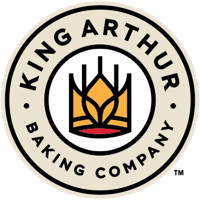




September 3, 2020 at 11:42am
Total disapoinment! A logo is supossed to say who you are and instill confidence in your product. You have failed on both counts. Your new logo says I had a contest and guess what the children came up with. Are you really looking to attract children to your sight (who by the way have no buying power, i.e. theyare not your consumer) or serious bakers who look to King Arthur Flour as a go to for quality products, recipes and confidence? Your new look has missed the mark by miles. Someone has not done their homework. The powers to be have obviously lost confidence in King Arthur Flour. Are you striving to be comon place (i.e. Pillsbury) or is the goal to offer the best flour products available? Unfortunate, but the handwriting is on the wall along with the kiddie drawings.